Why your landing page isn't converting (and it's not the headline)
The first thing most clients do when a landing page isn't converting is change the headline. Then the subheadline. Then the button copy. Then they run an A/B test between two headlines that are fundamentally the same message.
None of this works because the problem is almost never the headline.
We've audited dozens of landing pages over the past two years, and the structural failures repeat in predictable patterns. Here's what we look for before touching a single word.
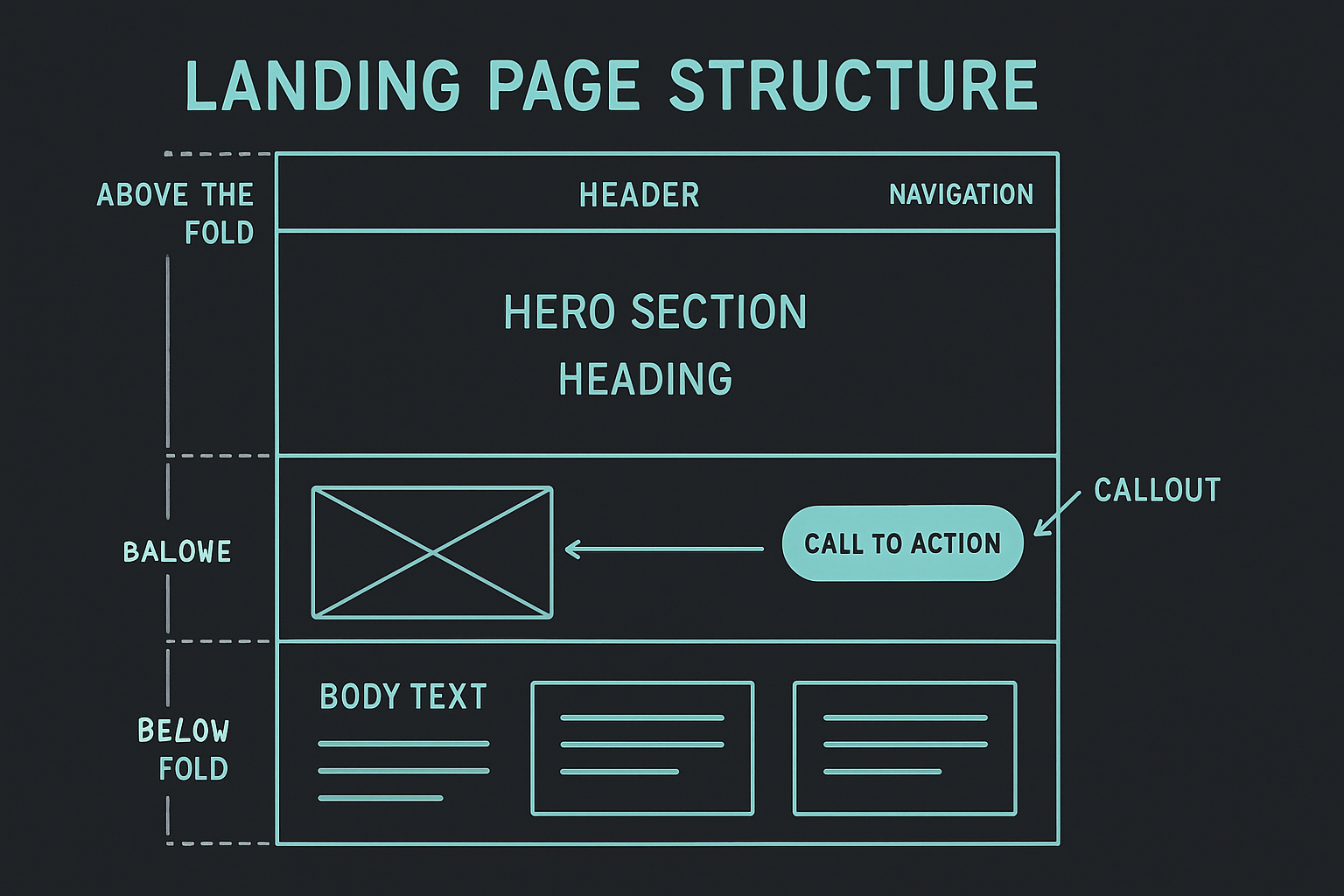
The value proposition exists only in the hero
Most landing pages explain the offer once — in the hero — and then spend the rest of the page repeating it in different formats. If a user scrolls past the hero without understanding what they're looking at, nothing below it will save them.
The fix is not to repeat the headline. It's to reinforce the core value at each stage of the page through evidence, not assertion. Features sections, testimonials, and comparison tables should each be independently convincing — not just decorative support for the hero copy.
When we audit a page, we cover the hero and ask: does this section still move a user toward action? If the answer is no, the section isn't doing its job.
The action is buried or vague
The most common structural failure we see: there's one CTA in the hero and then nothing for three or four full sections. By the time the next CTA appears, the user has either already decided or already left.
A related problem: the CTA says "Get started" or "Learn more" without any indication of what happens next. What does "get started" mean? Is there a form? A call? A free trial? A price?
CTAs work when they're specific and predictable. "Book a 20-minute call" converts better than "Contact us." "Start free — no card required" converts better than "Try it free."
The page was designed for someone who already understands the category
This one is harder to spot from the inside. When you've been working on a product for six months, the vocabulary feels obvious. To a first-time visitor, it's noise.
We test this by reading the hero copy to someone who knows nothing about the product. If they can't explain back what the product does in two sentences, the copy isn't doing enough work. This isn't a writing problem — it's a structure problem. The page is assuming context the visitor doesn't have.
Social proof is decorative, not functional
Logo strips and five-star averages don't convert. They're present on so many bad products that they've lost their signal value.
What works: specific claims tied to specific outcomes, from named people in recognisable roles. Not "Game-changing!" but "We cut our onboarding time from three weeks to four days." The specificity is what makes it credible.
Testimonials should answer the exact objection a user would have at the point in the page where they appear. A testimonial about ease of use belongs near the pricing section where complexity anxiety peaks — not buried in the middle of the page between two feature lists.
The mobile version is an afterthought
Most landing pages are designed on a laptop and adapted for mobile as a second pass. The result is usually a page where the desktop hierarchy doesn't translate — elements are in the wrong order, CTAs are below the fold, and text that made sense in a two-column layout becomes a wall of copy on a single column.
We design mobile first, not because it's a trend but because it forces prioritisation. If something doesn't work in a single 375px column, it probably doesn't work at all. The desktop version inherits the discipline of the mobile decisions, not the other way around.
None of these problems require a headline rewrite to fix. They require structural changes — rearranging the information hierarchy, making CTAs more specific, writing social proof that does actual work. The headline usually sounds fine once the structure is right.
If your landing page isn't converting and you've already exhausted the headline iterations, reach out and we'll run the structural audit. We'll tell you what's actually broken before we suggest anything else.
Want us to audit your landing page?
We review the structure, hierarchy, and CTA logic. You get a written report within three business days — no pitch call required.
Request a structural audit